Location:
Guinsay, Danao, Cebu
Typology:
Masterplan
Status:
Bidding
Lot Area:
9,632.41 sq. meters
Floor Area:
4,335.80 sq. meters
Design Team:
Jason Chua
Renzo Villaran
Joshua Mabitad
Von Gumboc
Impl. Team:
Manuel Siaotong
Jurand Edpan
Eureka Quijano
mirani steps danao
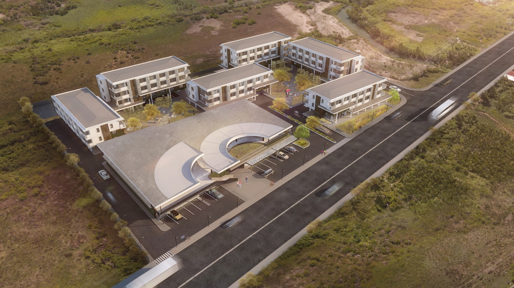
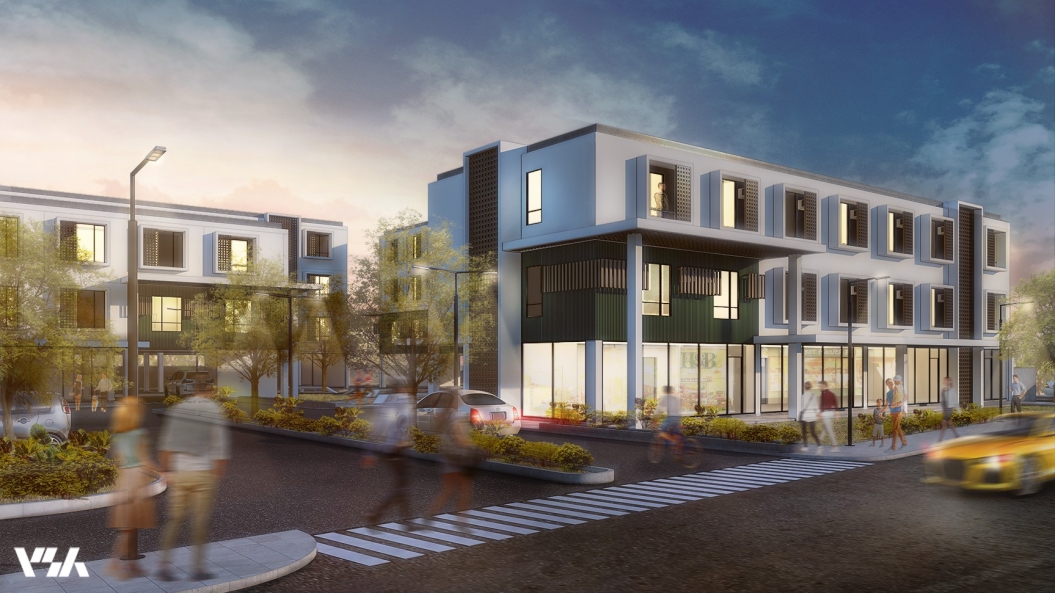
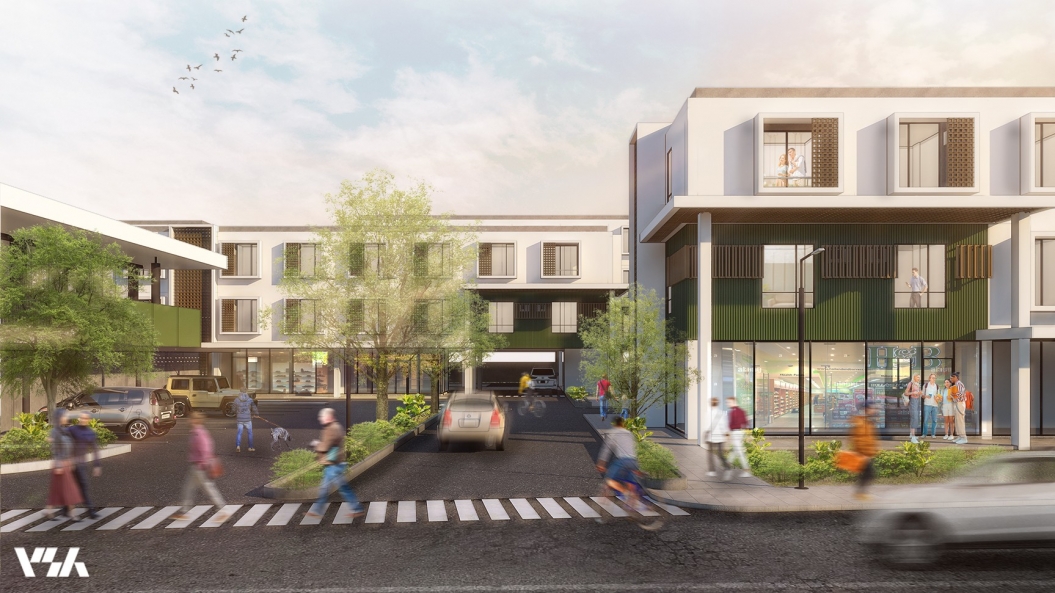
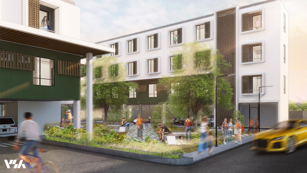
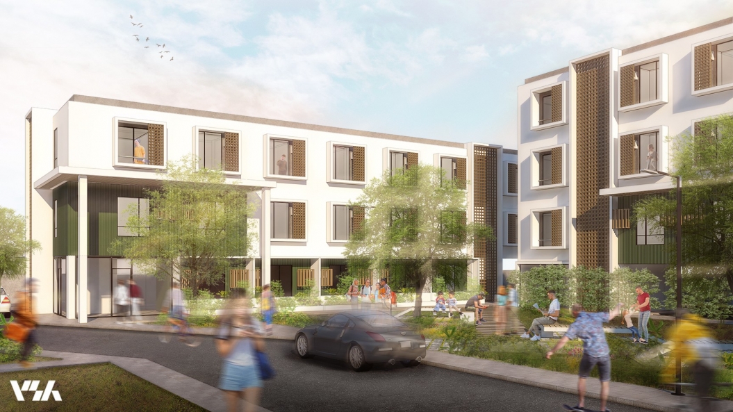
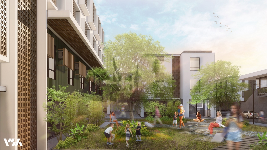
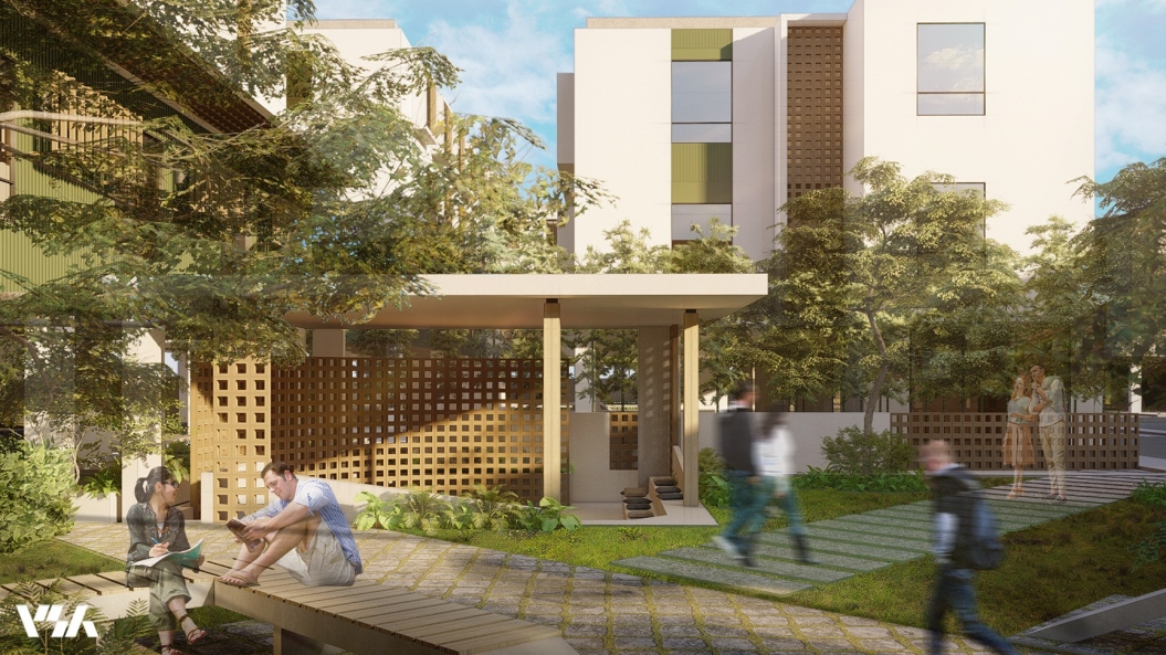
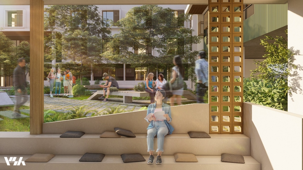
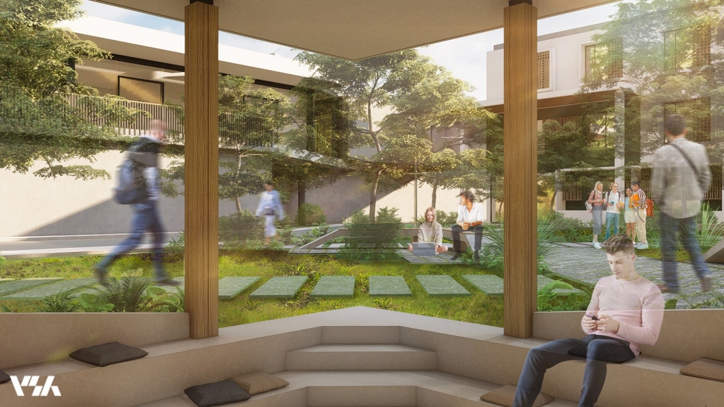
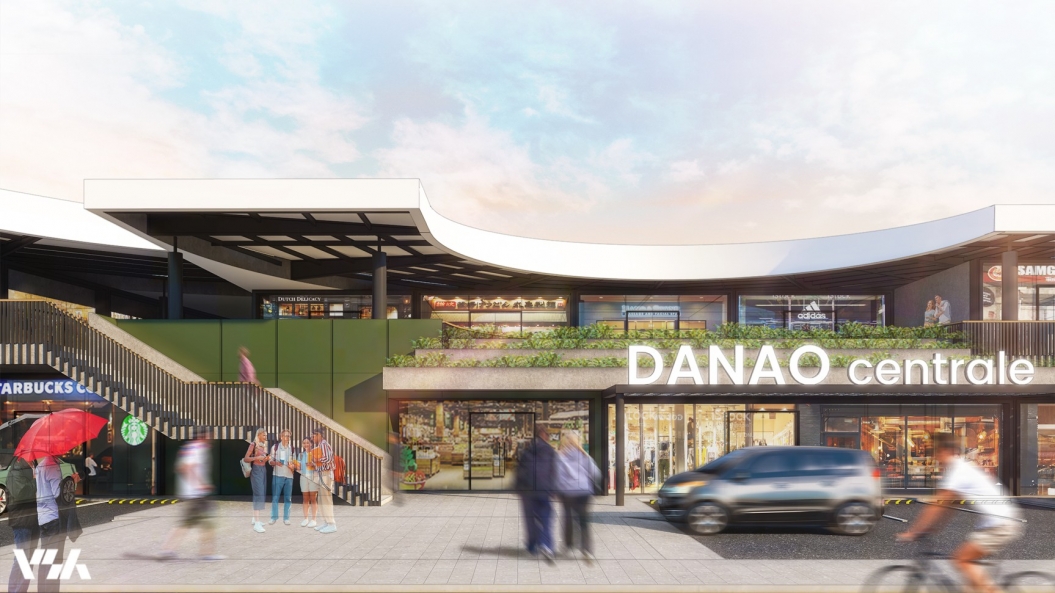
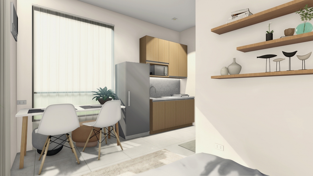
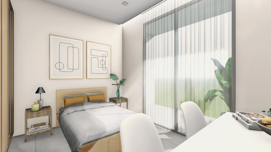
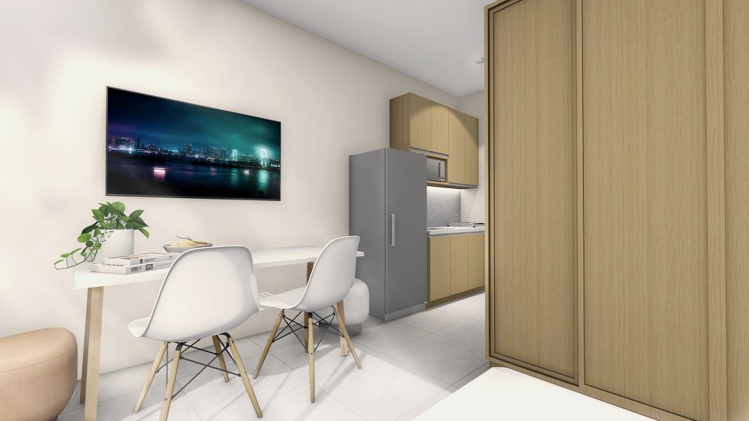
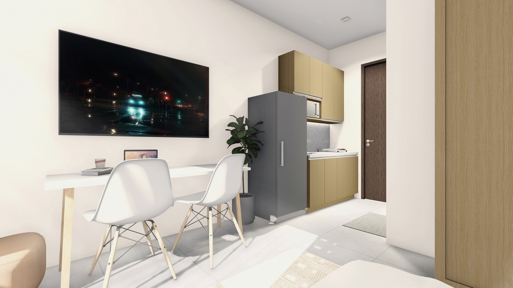
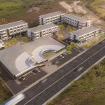
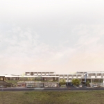
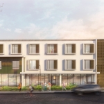
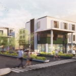
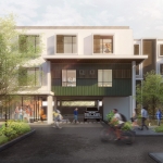
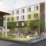
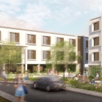
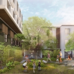
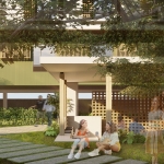
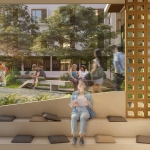
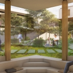
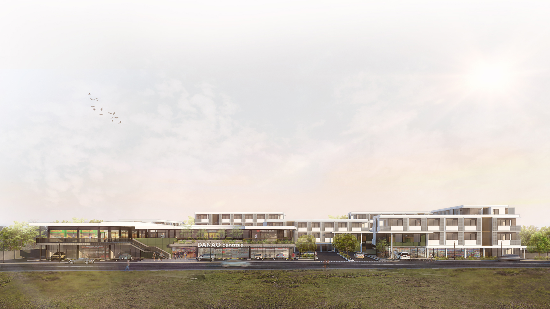
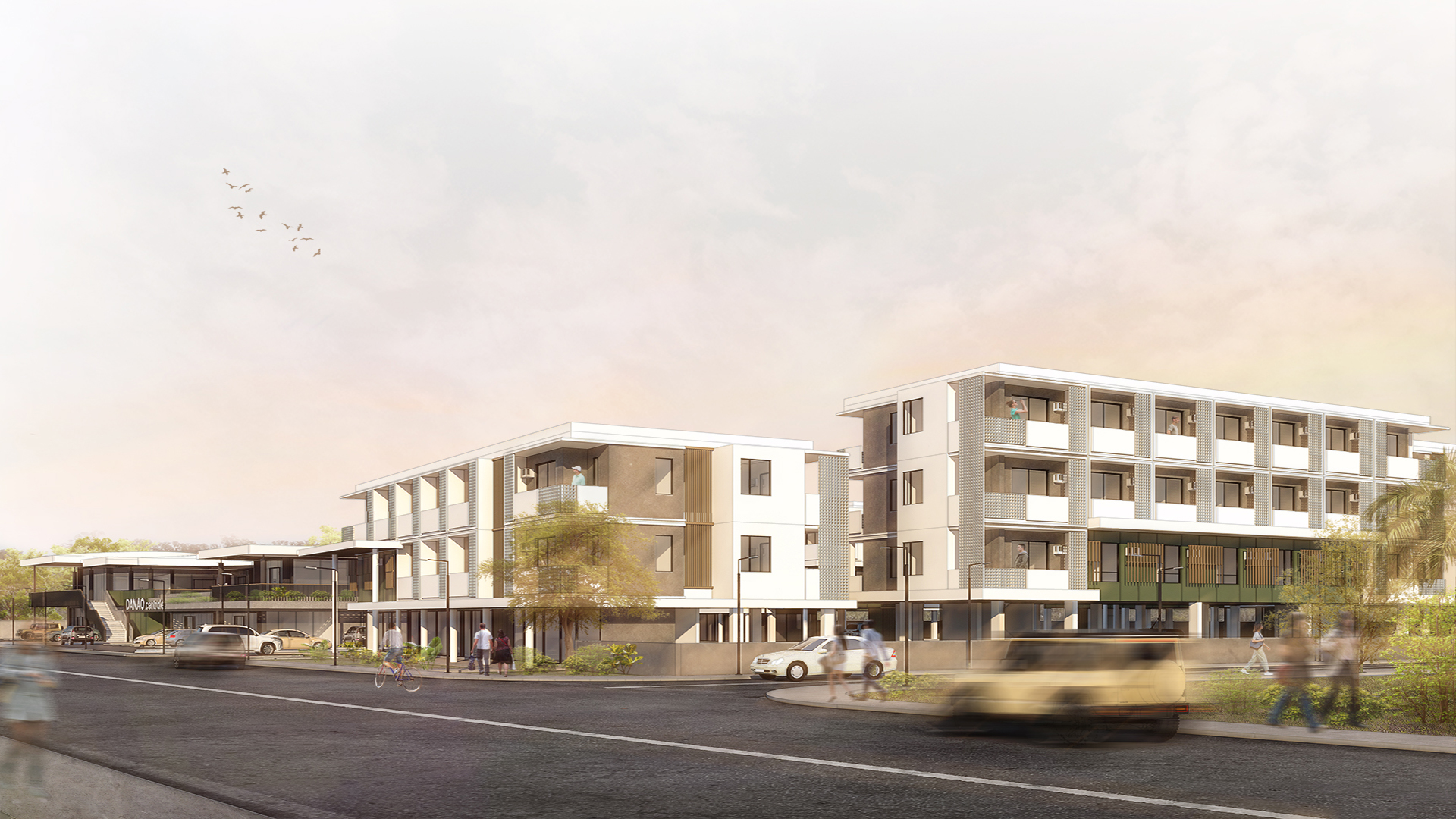
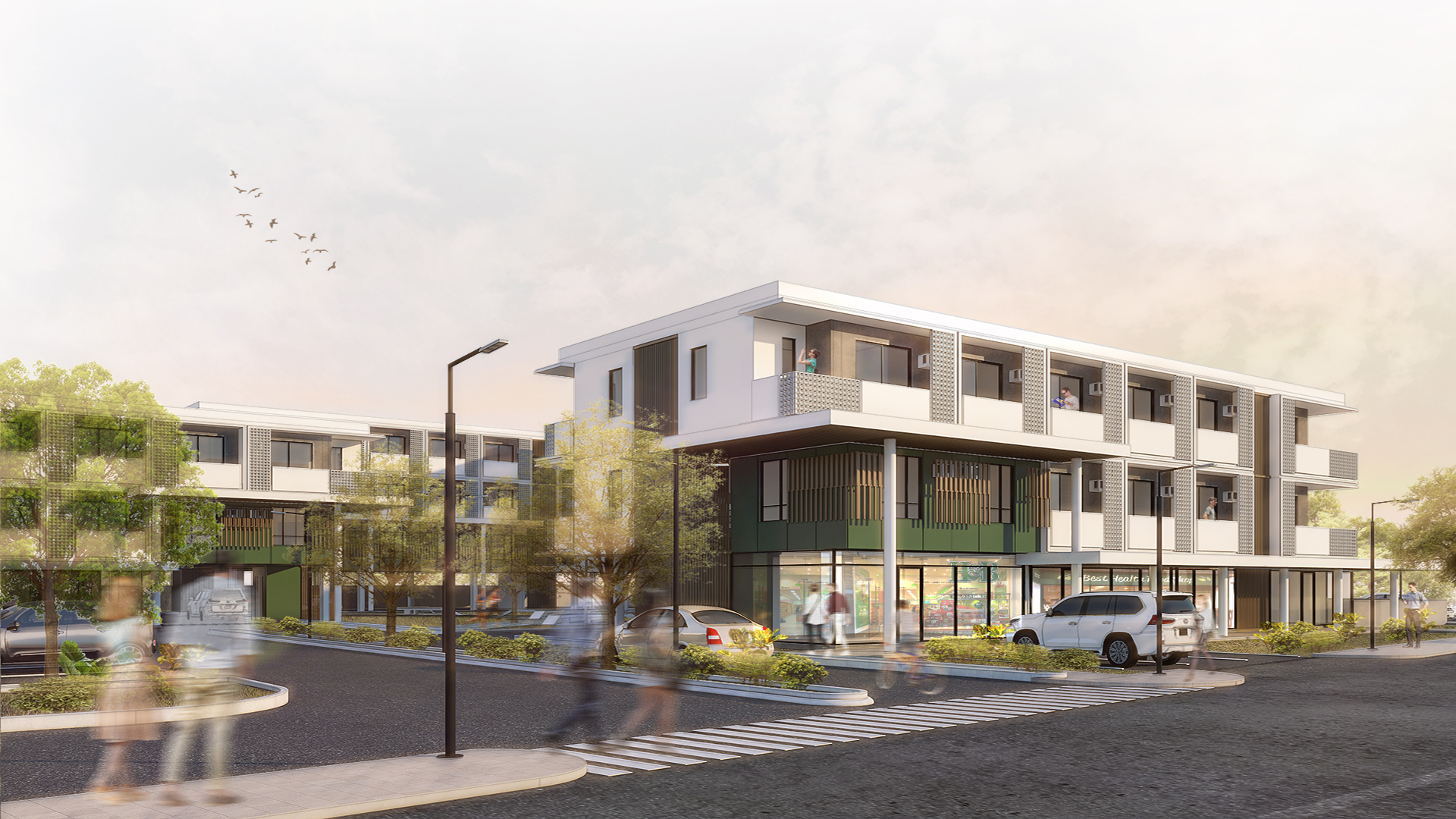
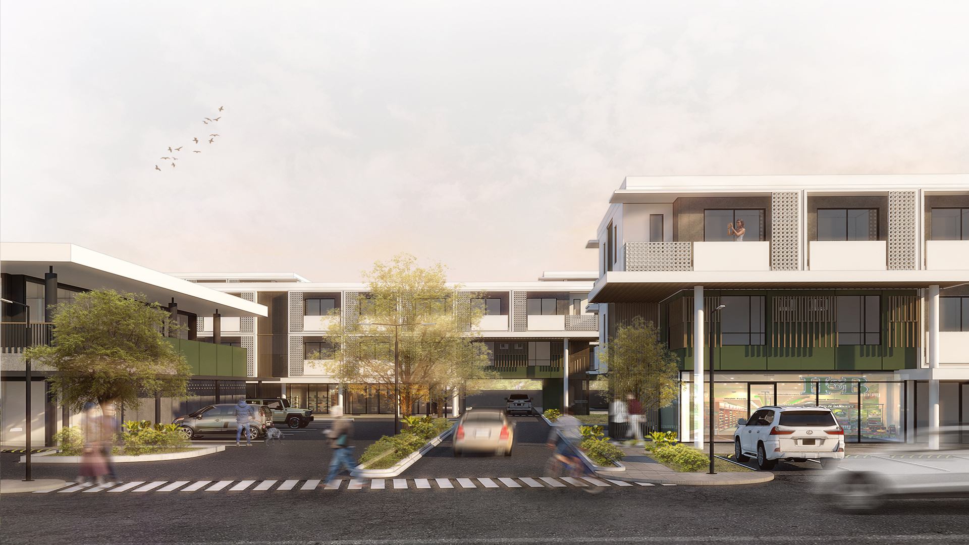
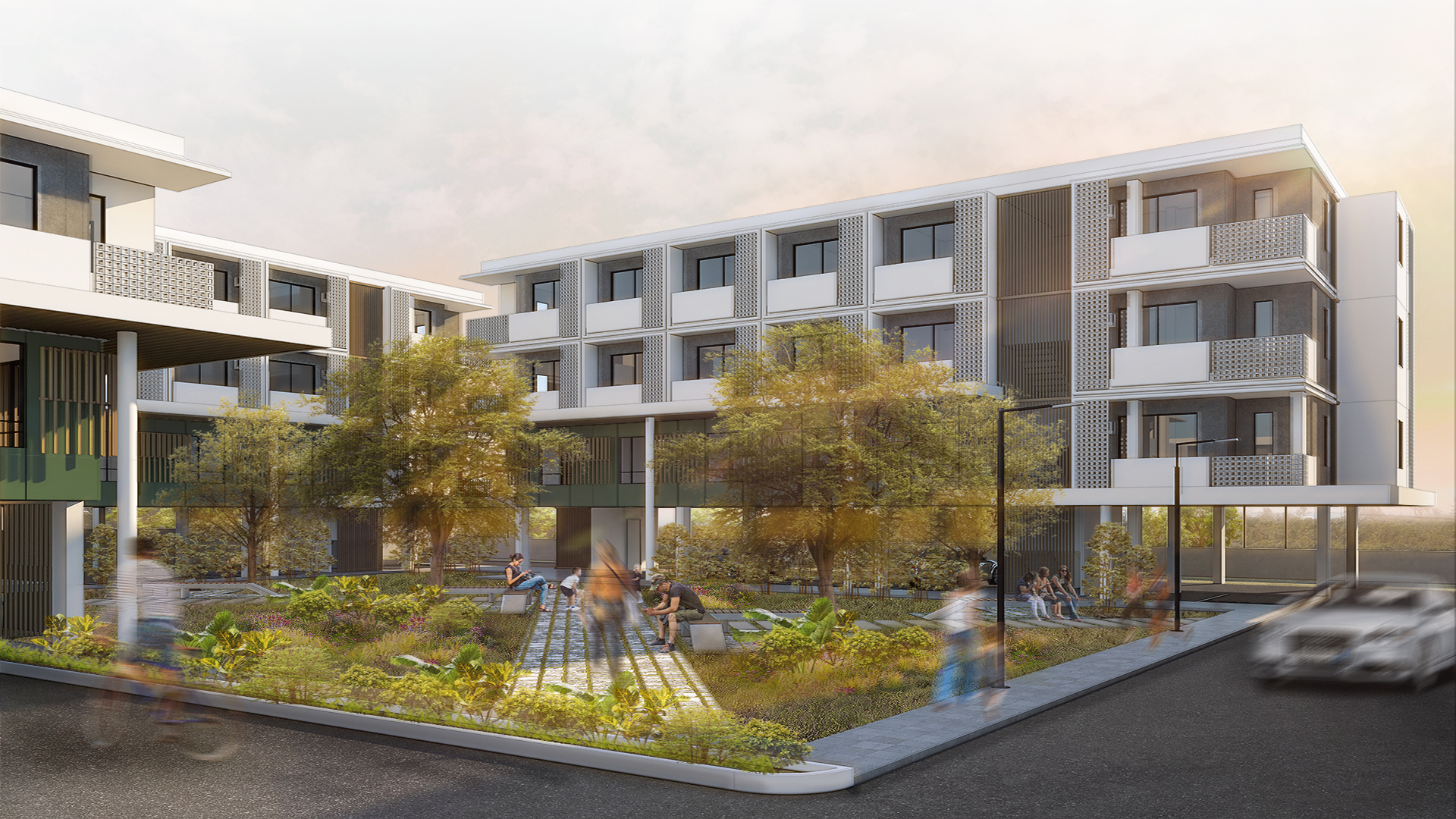
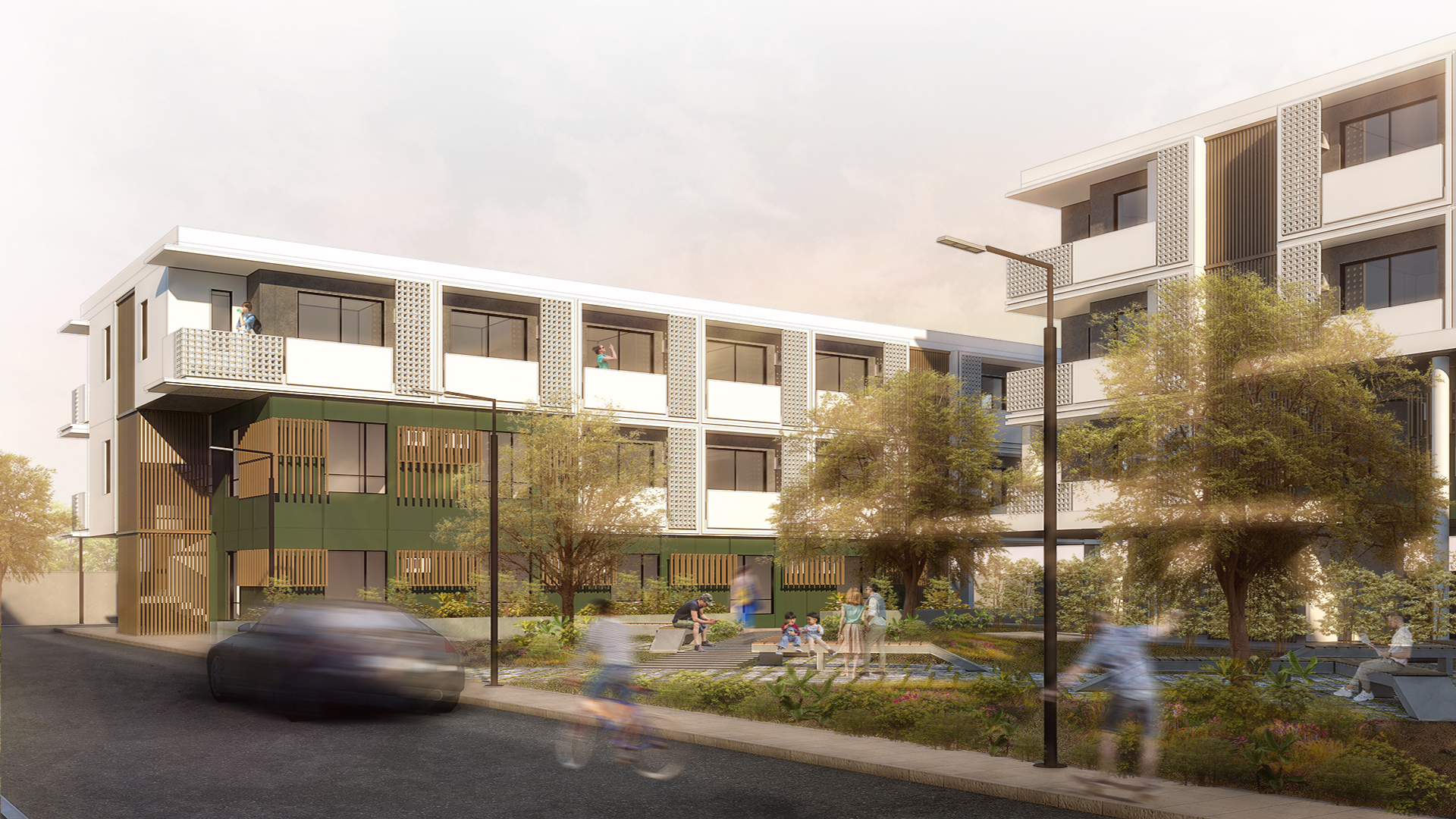
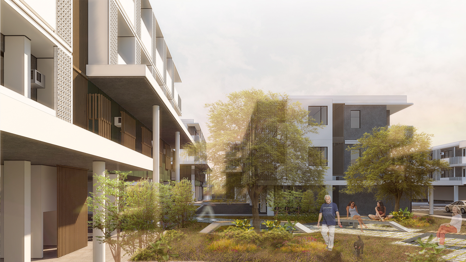
Honoured to be working with one of the country’s leading developers— Cebu Landmasters, Inc. in creating affordable, thoughtfully-designed , user-centric communities for every Filipino. This community consists of six medium-rise residential buildings and a two storey commercial building. Each structure is precisely oriented to create ample open spaces for people to relax, foster friendships, and cultivate a healthy lifestyle.
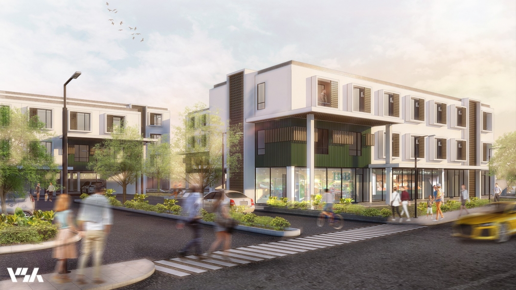
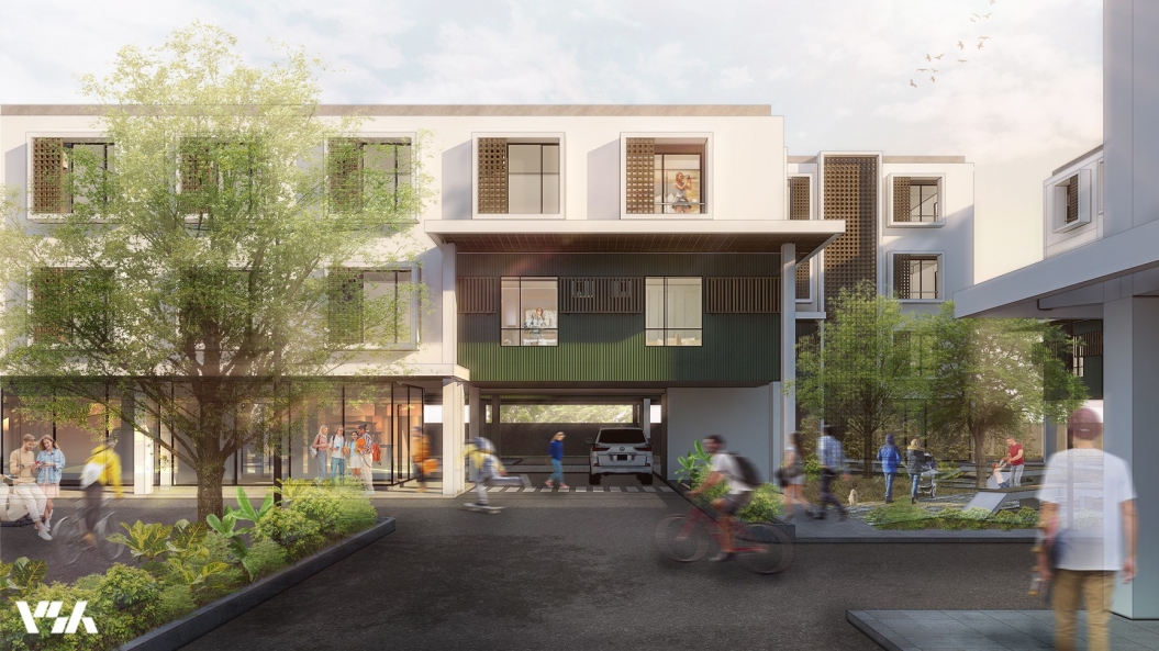
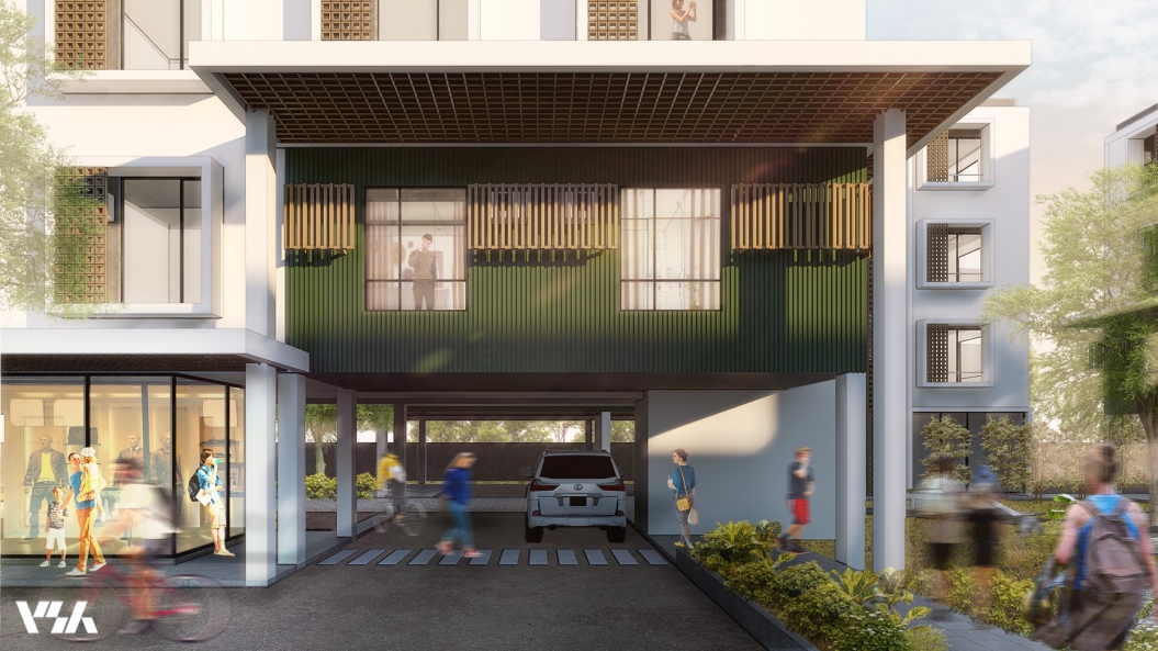
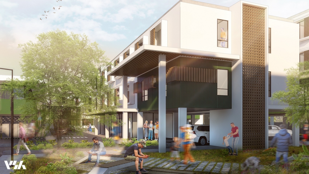
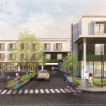
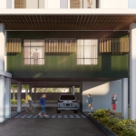
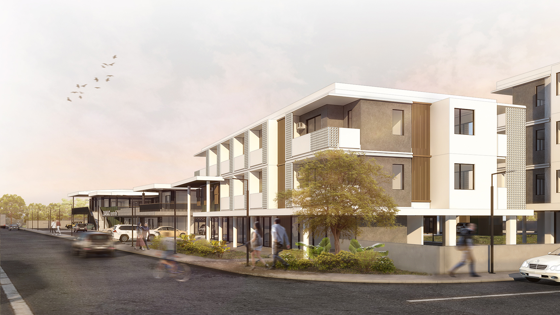
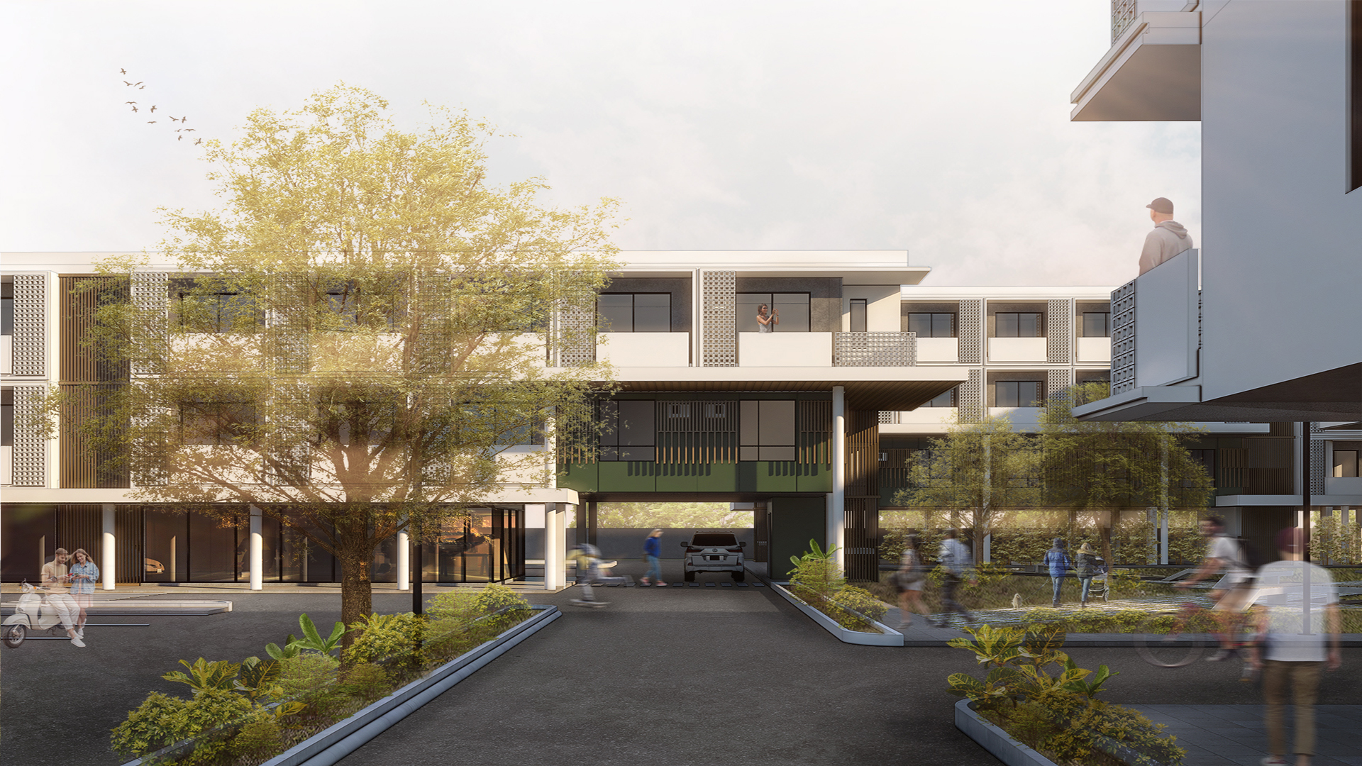
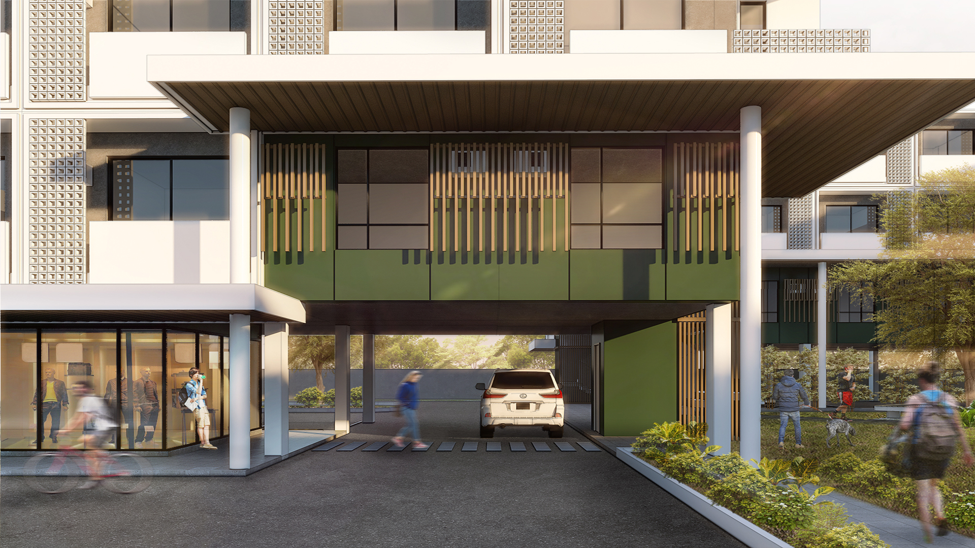
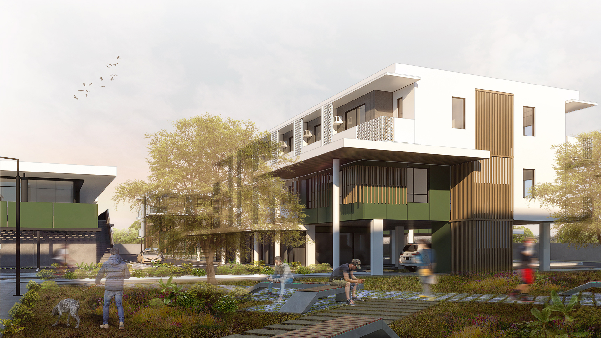
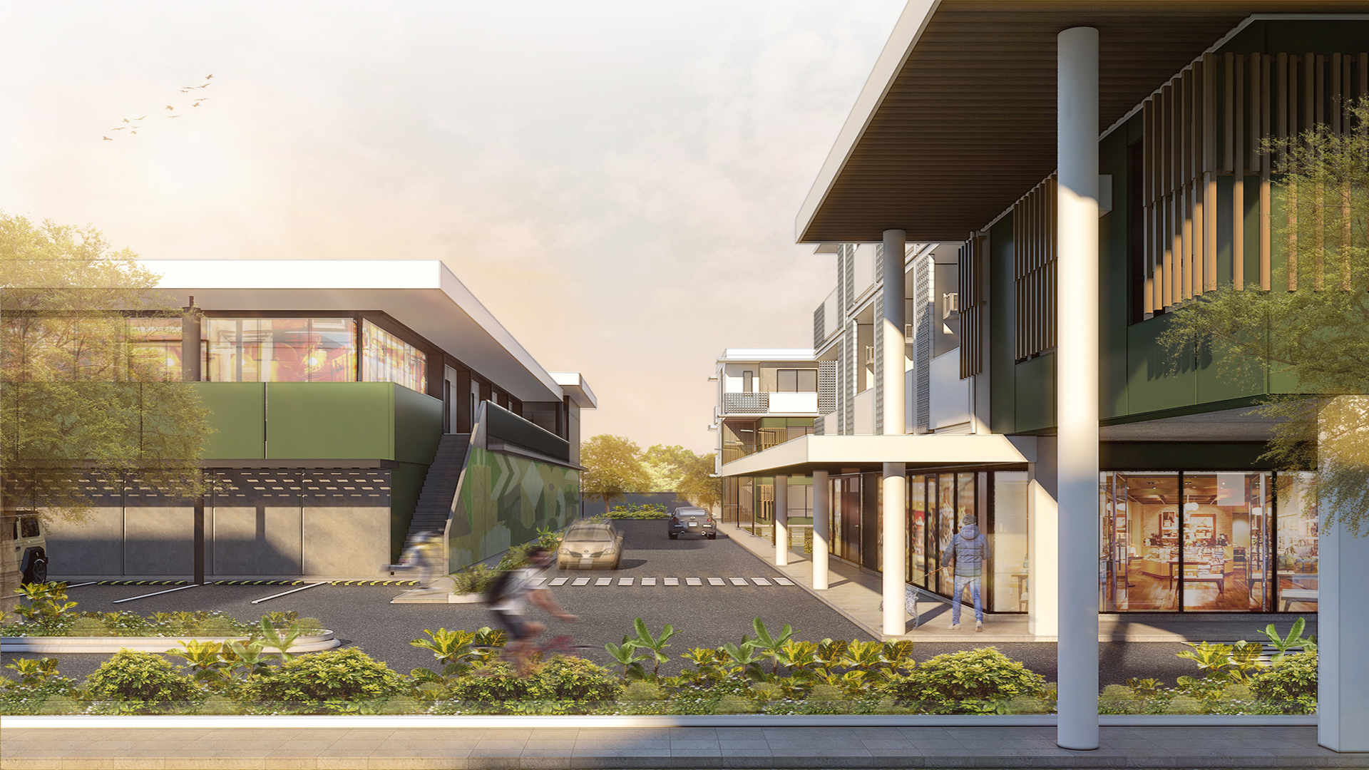
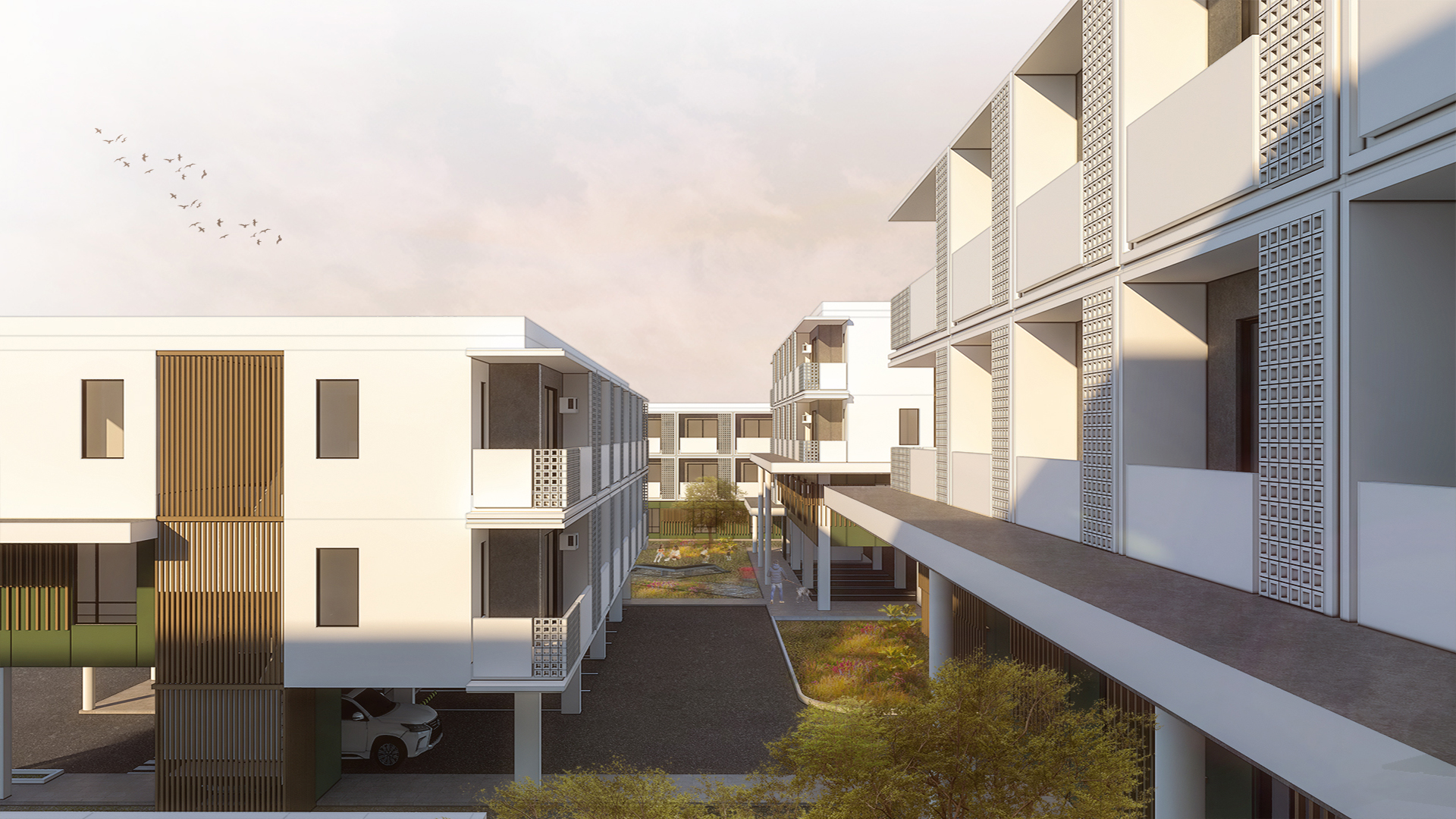
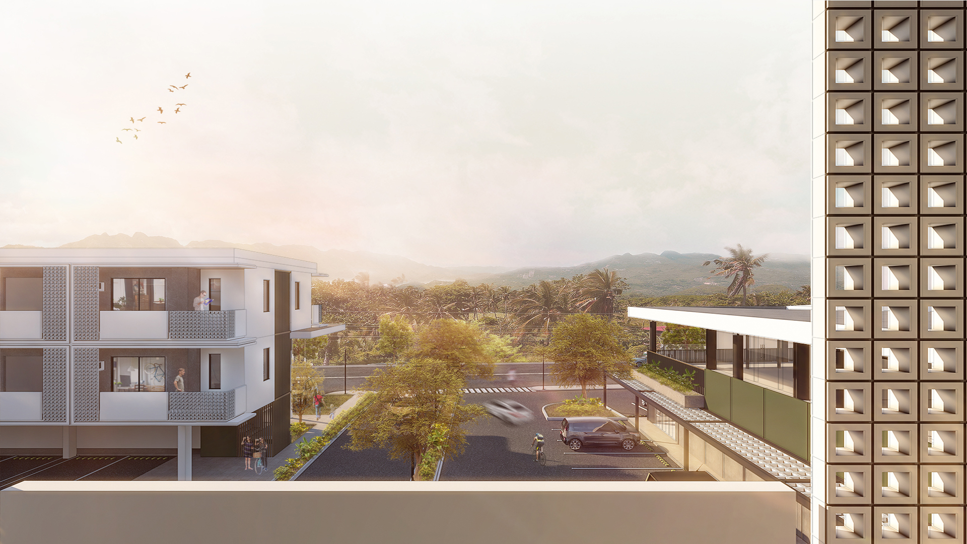
To reinforce this goal, the road network intentionally passes underneath the residential buildings to separate it from pedestrian circulation and place it out of sight. This gesture encourages movement throughout the development and insinuates a pedestrian-first mindset within the community.
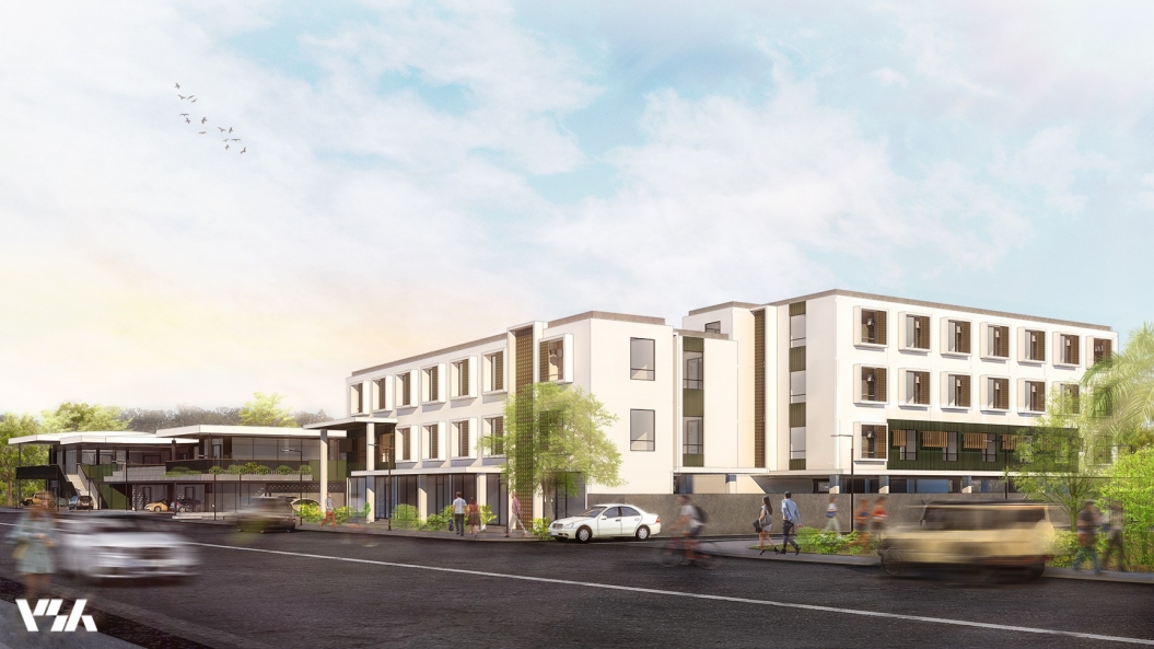
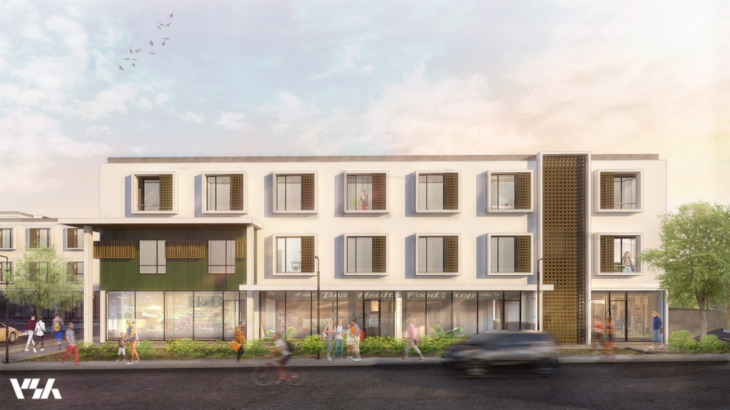
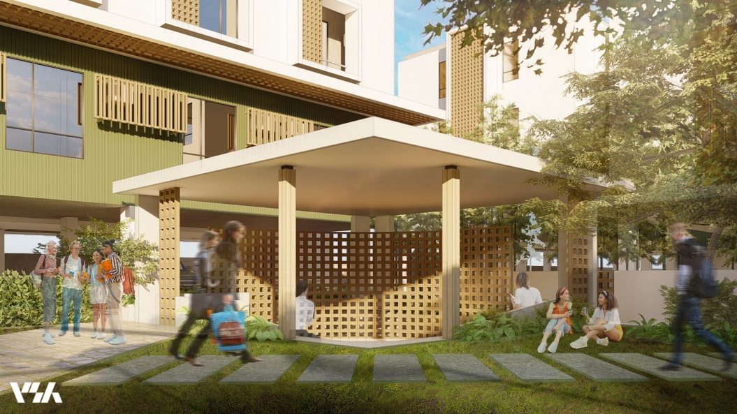
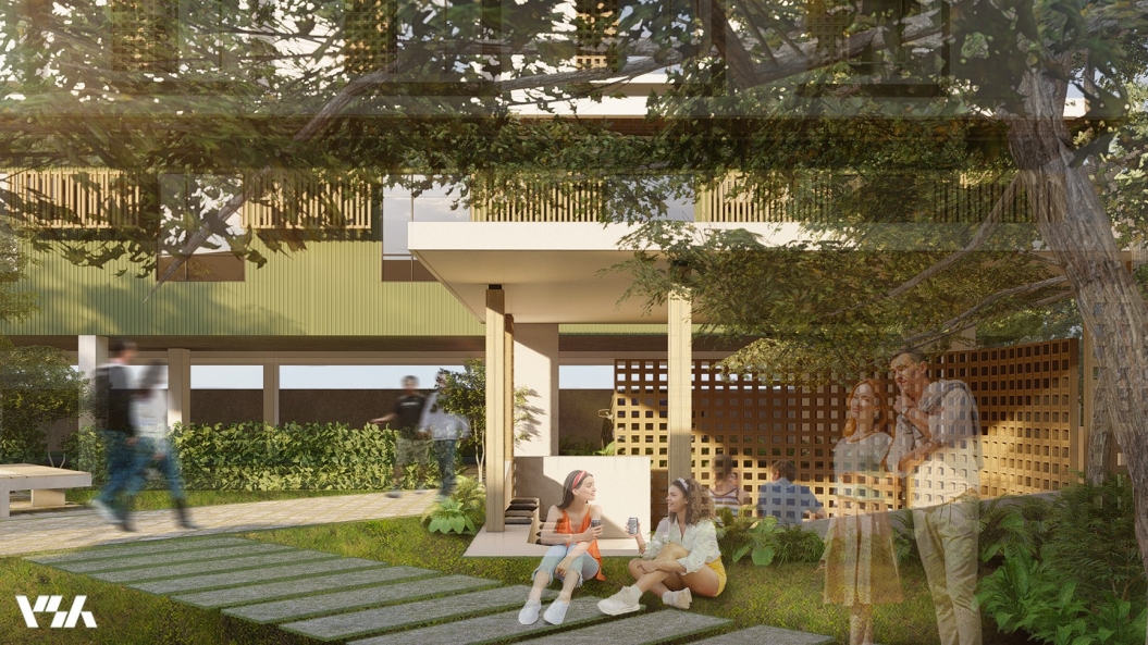
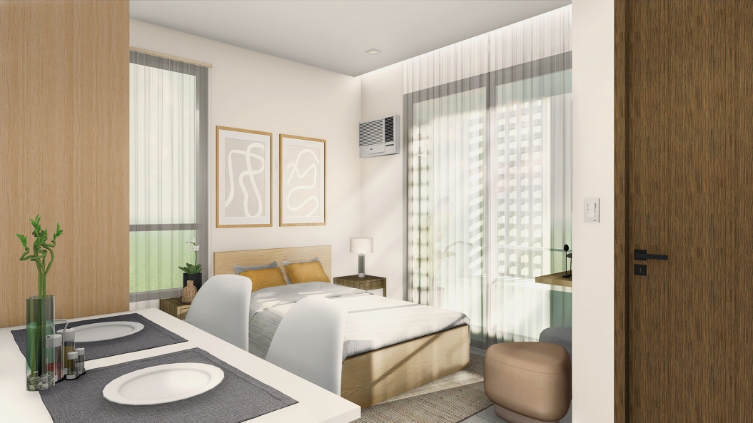
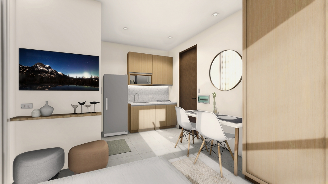
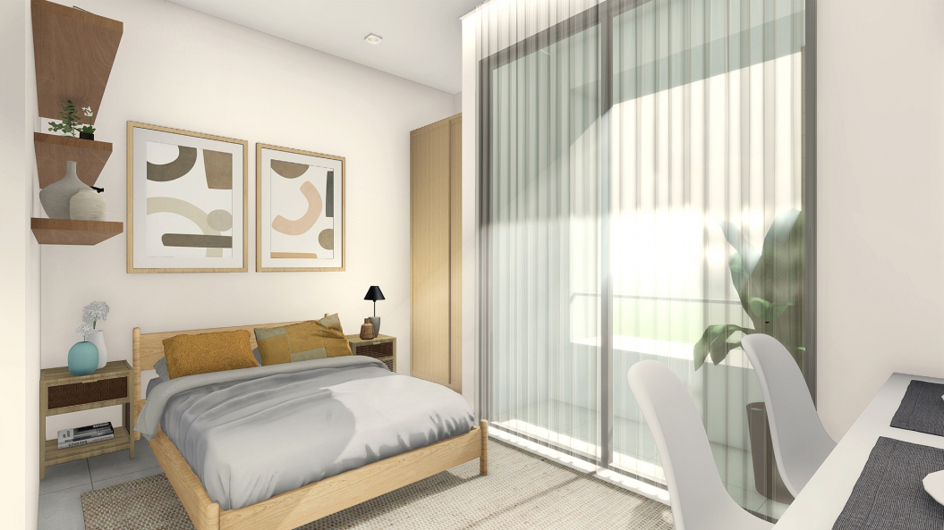
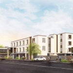
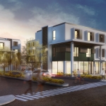
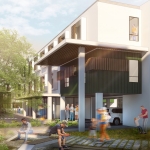
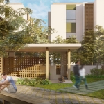
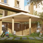
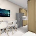
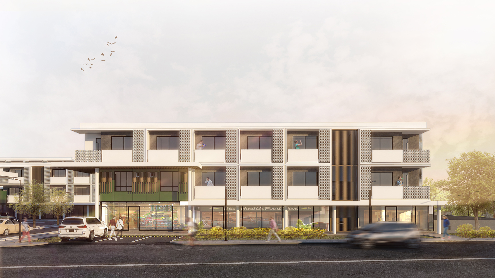
For the residential condominiums, it was imperative to maximize sight lines and vistas to the courtyards and surrounding landscapes through precise site planning. To further create a strong sense of community, corner units were “de-emphasized”; blurring the lines where one building ends and the next begins. A square-framed canopy dots the facade creating a portal from which to view the vistas beyond.
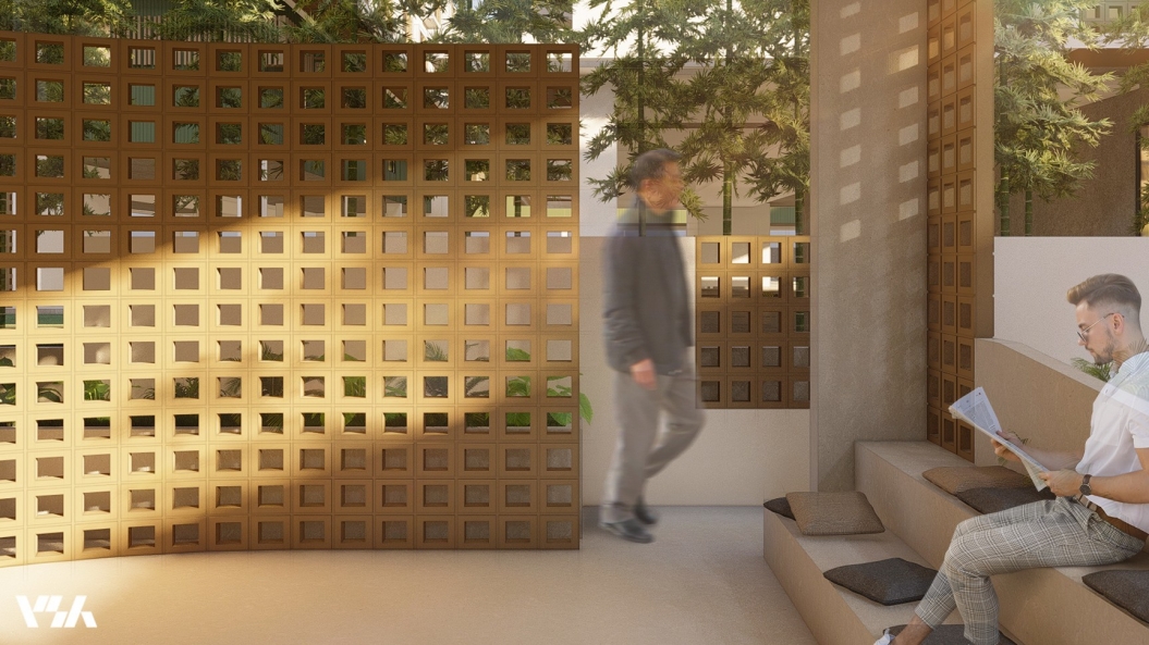
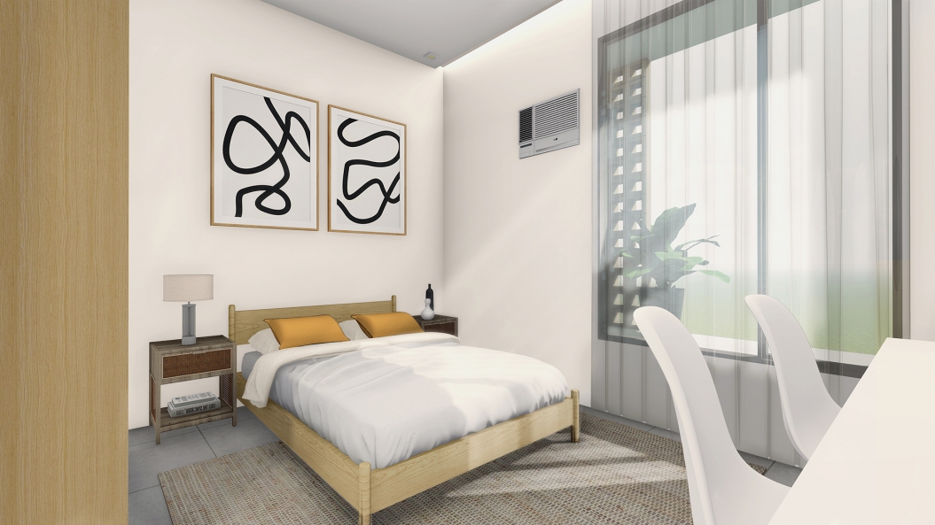
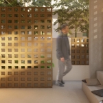
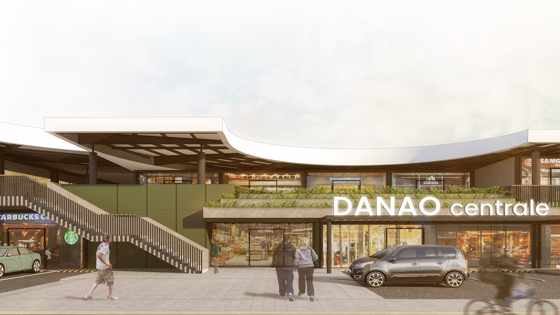
This same canopy treatment is carried throughout the entire development creating a cohesive identity for the entire community. Green colored accent walls are derived from the color of water on a lagoon. A nod to the historical name of the city which derives from the word danaw (lagoon). These walls mark the entry portals of each building, serving as visual cues for instinctive wayfinding. Lastly, concrete decorative breeze blocks conceal air-conditioning units and lessen heat gain within the individual flats. This same treatment adds texture and pattern to the facade further creating a distinct identity for the development while adding a strong sense of permanence.
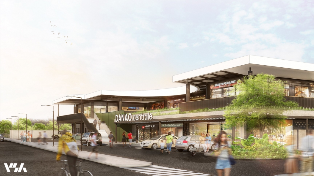
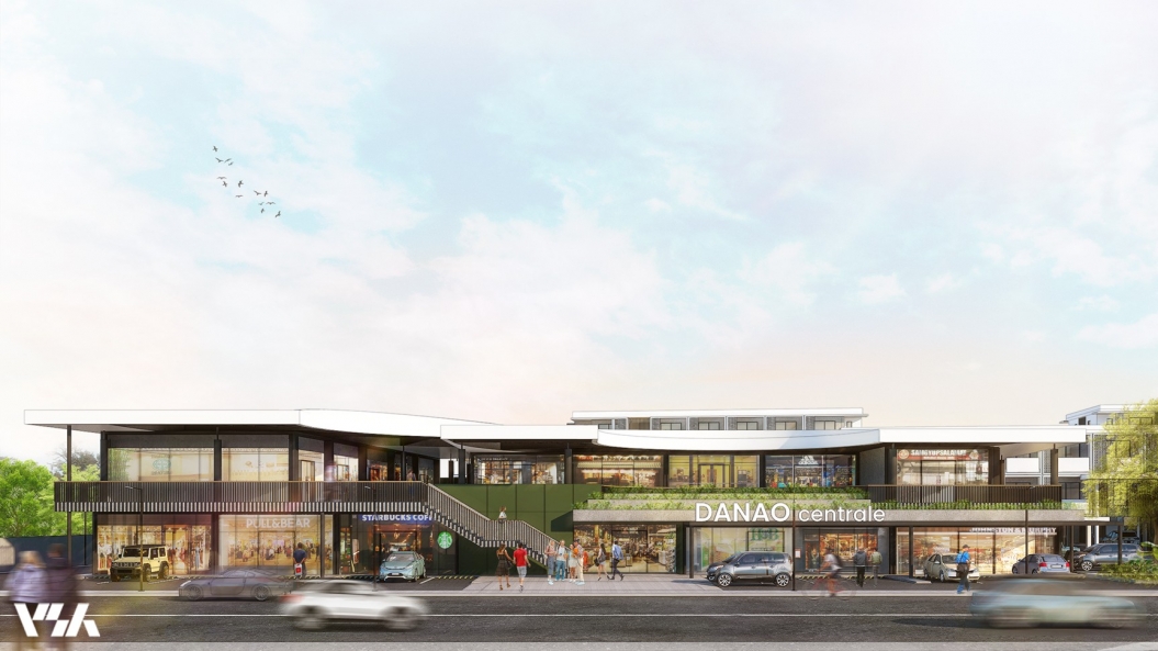
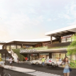
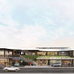
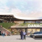
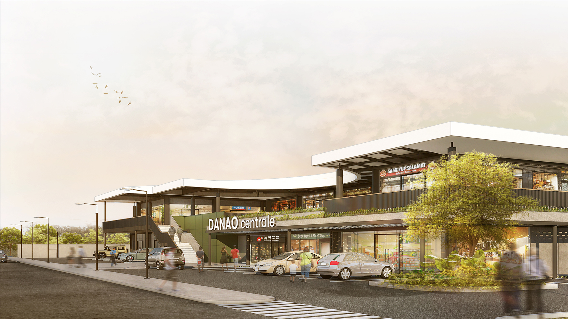
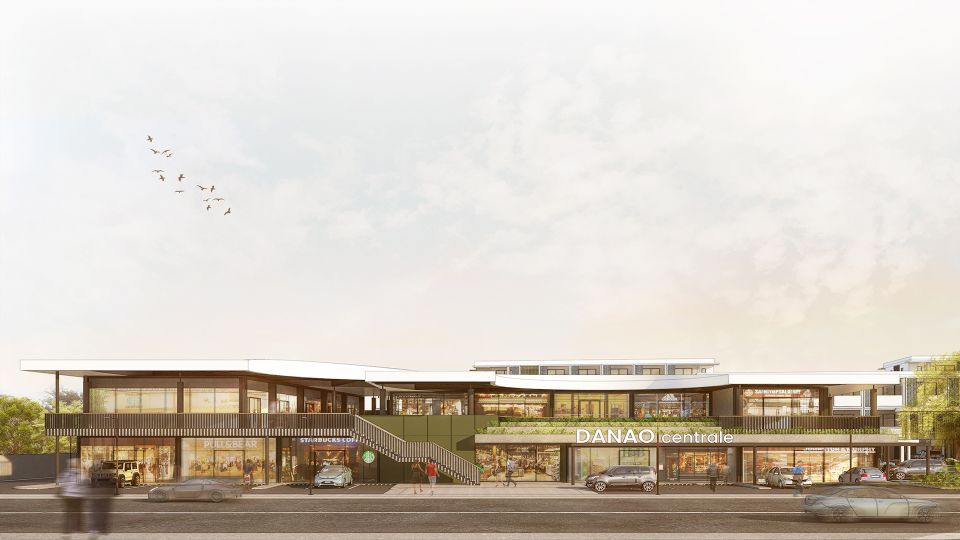
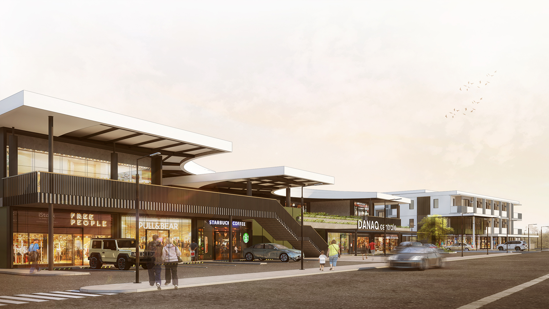
Danao has long served as an intuitive “marker” for Cebuano’s driving up north. The distinct shape of the cylindrical sugar mills instantly tells passers-by that they are in the city already. We decided to derive the form of the commercial structure from this idea but instead of creating a bulging round shape, we instead created a recessed curve that mimics an embrace. This inviting gesture not only catches the eye but also intuitively tells future passers-by to experience this vibrant development while breaking the monotony of the long drive up north.
As a whole, we hope this community will serve as a new marker for the ever-growing city, a home for future generations, and a place that ages as gracefully as the families that call it home.












 flor tan
 marc jamio
 therese martinez
 mattheu gaviola
 thyra del mar
 kyle monteclaro
 lloyd cabahug
 vannesa lu
 cathy solis
 charie canoy
 jamie samonte
 katrina diola
 joseph compra
 warren alombro
 earl memoracion
 kieth garcia
 chen tan
 joshua mabitad
 grace florita
 carlo del mar
 renzo villaran
 almira de guzman
 shanane malahay
 jonah roble
 manuel siaotong
 irvin flores
 brian perandos
 jason chua