Location:
GF, Primeway Plaza, 176 F. Ramos St, Cebu City, 6000
Typology:
Interior
Status:
Completed
Lot Area:
– sq. meters
Floor Area:
31.39 sq. meters
Design Team:
Shanane Malahay
Lionel Torre
Jason Chua
neighborhood wash
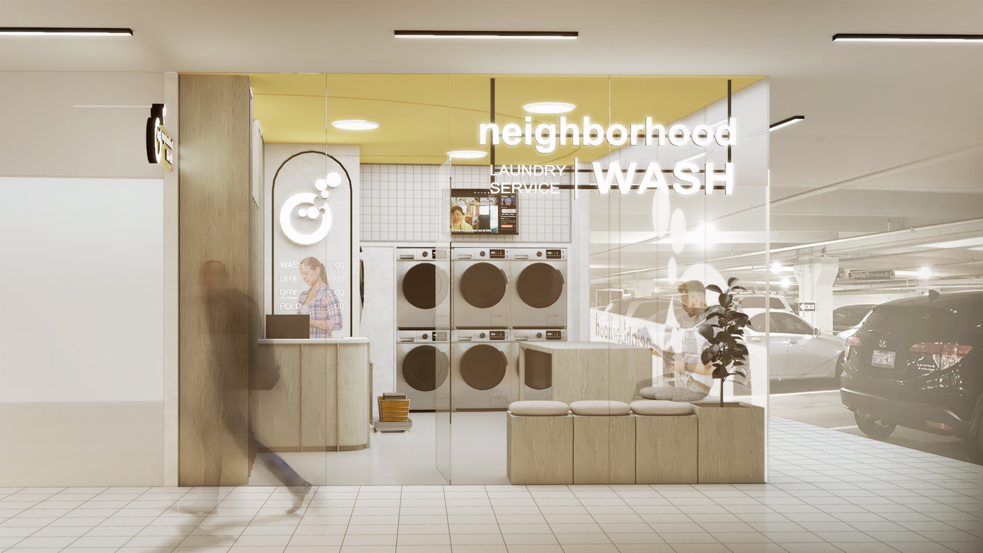
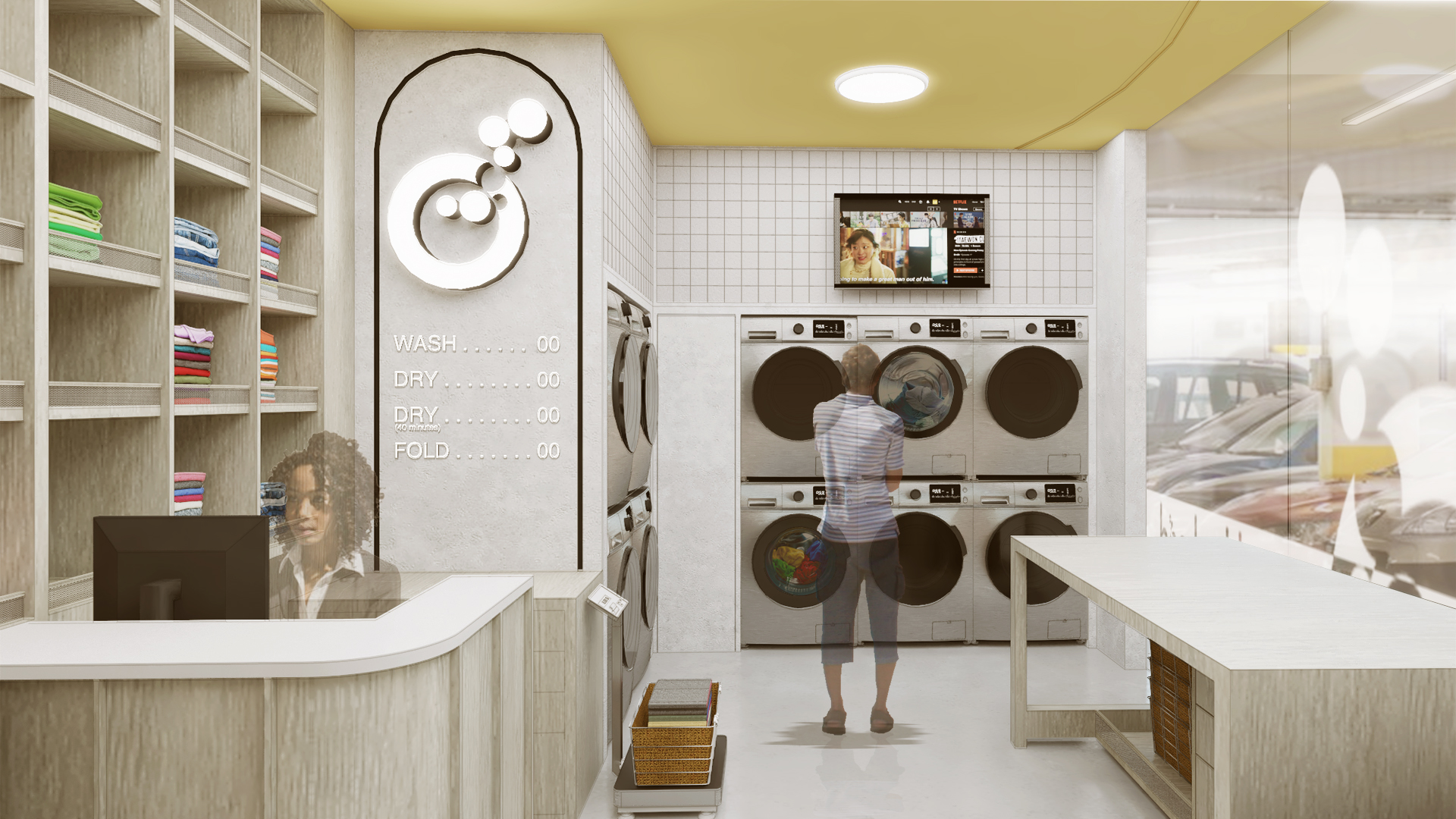
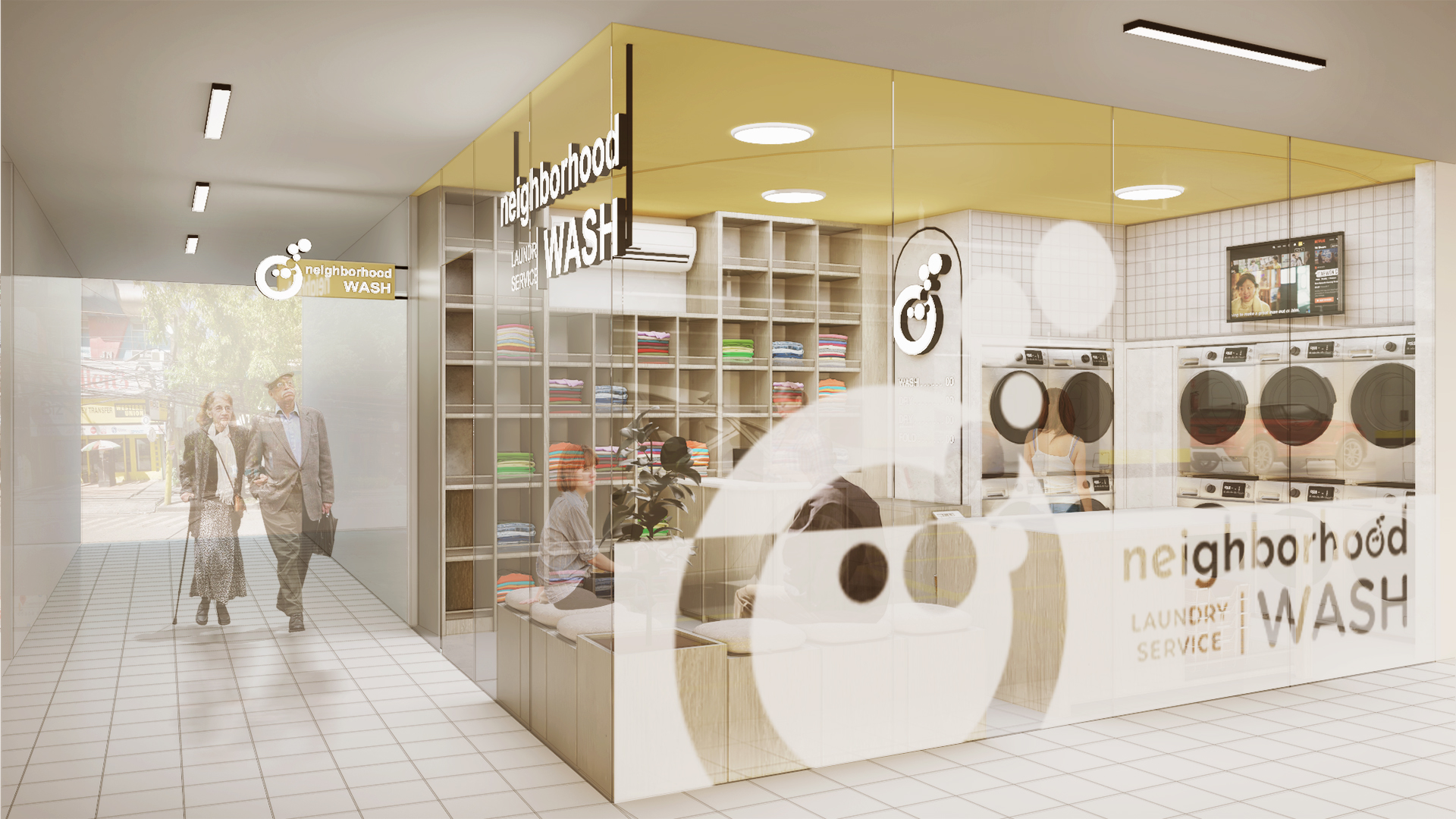
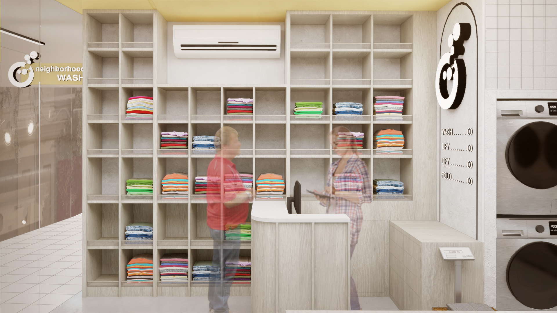
A laundromat can be quite a boring place, if not designed with the user’s comfortability in mind. To create an atmosphere that is welcoming and that represents the brand as well, a color scheme of warm yellows matched with light tones is used in the laundromat’s interiors. Moreover, as an accent to contrast the plain colors, an alabaster tile wall is integrated into the design to represent order and neatness.
The shelves are not only designed for its utility and storage, but also as an element to create depth and dynamics within the interiors. Furthermore, the furniture contributes towards the circulation of the laundromat and gives the interior more space. As a method of implementing security which also doubles as a marketing feature, a frosted sticker of the laundromat’s brand wraps around the exterior glass.
Although the laundromat takes up a small space, it was given the same effort as any other project to make it less of a boring place, and more of one that people look forward to going to for their laundry needs.



 flor tan
 marc jamio
 therese martinez
 mattheu gaviola
 thyra del mar
 kyle monteclaro
 lloyd cabahug
 vannesa lu
 cathy solis
 charie canoy
 jamie samonte
 katrina diola
 joseph compra
 warren alombro
 earl memoracion
 kieth garcia
 chen tan
 joshua mabitad
 grace florita
 carlo del mar
 renzo villaran
 almira de guzman
 shanane malahay
 jonah roble
 manuel siaotong
 irvin flores
 brian perandos
 jason chua